To the examiner,
I hope you enjoy taking the time to look through my blog and the work which I have produced over the last few months. Looking back to the start, and then to my final piece, you can see how much improvement has been made, and I am very please that I have learnt this skills on PhotoShop and hope to use them in the future. I put in a lot of effort to my research and planning in order to be able to produce the best magazine I could. Throughout my blog I have show where my inspiration has came from, and what I have done to my final piece in order to make it different to others. Hope you enjoy my blog! Thanks, Jack.
Thursday 29 March 2012
Final Evaluation question 6
What have you learnt about technologies from the process of constructing this product?
Looking back to when we first started this task, I knew very little about camera use and the different types of shots which can be used to adjust the lighting, and the presence of your model. I used my own camera which is a Sony camera, 12.1 mega pixels. This provided good quality pictures at first, but seemed to lack the final edge to them once they had been put on to PhotoShop. I then therefore swapped camera to using the schools cameras, which had a better final touch to them. I took many test shots so I could get used to how the cameras lighting and quality worked, before selecting which photos where best, after receiving feedback from some students in the class about which they thought were the best ones.
Apart from photography, I have used a wide range of internet programs which I have never used before, the most obvious one being PhotoShop. Over the period of time I feel that I have became more advanced in the program, and now find the majority of it very easy to use. Cutting photos out and changing the ways that they look eg. Black and white, hue, saturation, was a very big factor in my final product and I’m glad that I have learnt this skills so that I can take them on it the future
Other programs that I hadn’t used before were programs such as Scribd, Slideshare, Flickr and even Blogger. I have learnt about all the different ways Microsoft Word and Microsoft Powerpoint documents can be uploaded to my blog, and how to embed codes in order to present the post clearly.


Final Evaluation question 1
In What ways does your Media product use, develop or challenge forms and conventions of real Media products?
As soon as this task was set I decided that I was going to do an indie/rock genre, as that is my personal favourite style of music, and the one which I know most about. After reading indie/rock magazines for a long period of time, I felt that I had instant inspiration from them, in the way that they are set out and how they look; colour schemes and type of language for instance.
I looked at magazines online and in real life, the main one being NME magazine, my weekly read. I also explored into the Rolling Stone magazine, Q magazine and Kerrang. All magazines are similar in the way they are presented, but just have a slightly different genre. For example, I found that the majority of the magazines focused the main story on what usually seemed to be male artists, which is where I got my inspiration to develop this and use a female artist instead. I did take inspiration from these magazines in how I layout my front cover, with a large masthead at the top and the main image in the centre.


+copy.jpg)

Wednesday 29 February 2012
Lesson 29.2.12
In todays lesson I have finished off my feedback evaluation and put it onto my blog. I have also uploading my 5 evaluation questions to scribd and started to put them onto my blog.
For my magazine I have partly cut out 2 pictures, both for my contents page. I plan to finish cutting these out next lesson and start to put wording into my contents page.
For my magazine I have partly cut out 2 pictures, both for my contents page. I plan to finish cutting these out next lesson and start to put wording into my contents page.
Magazine cover improvements
After recieving feedback on my magazine cover, I realised that there are a lot of improvements that can be made to all concepts of my magazine
Firstly, the front cover needs more adding to. For example, there needs to be a bar code and the date on there somewhere. I also think the main writing such as the masthead needs to stand out more, as it blends in with a lot of other text. I also need to think of using 2 or 3 more different fonts in order to make my magazine stand out and look different.
On my contents page I also need to change fonts of the heading a numbers. I also will be changing my pictures and adding more pictures, in order to give a better feel to what type on genre of music I am trying to get across. Size of the text will also need to be change so everything is similar.
My DPS was something I liked, but need to change my image and maybe add more images, so it again relates to my genre of music. The places of the text also need to be changed as some of it blends in, and some text doesn't quite match the picture.
Tuesday 28 February 2012
Sunday 26 February 2012
Draft Magazine shots


Tuesday 21 February 2012
Draft Magazine


Friday 3 February 2012
Magazine Genre
These are magazines which have inspired me as to how I want magazine. These show my genre (indie/rock) and the kind of style which I plan to do my magazine. The masthead from these is what inspired me to do mine, however mine will be different due to colour and fonts. Most of these have a mid-shot image in the middle of the page, and I'm doing a full body shot, but also doing mine in the middle of the page.
These are magazines which have inspired me as to how I want magazine. These show my genre (indie/rock) and the kind of style which I plan to do my magazine. The masthead from these is what inspired me to do mine, however mine will be different due to colour and fonts. Most of these have a mid-shot image in the middle of the page, and I'm doing a full body shot, but also doing mine in the middle of the page.
Title of magazine
AIM
The title I chose for my magazine is AIM. I chose this as it stands for Alternative Indie Music, which could be wrote underneath it on my front cover. I feel that this name is catchy and matches the indie genre, with a short, snappy title.
The title I chose for my magazine is AIM. I chose this as it stands for Alternative Indie Music, which could be wrote underneath it on my front cover. I feel that this name is catchy and matches the indie genre, with a short, snappy title.
Font ideas

Thursday 2 February 2012
Draft article
Lillia Dunkley - 'If you asked me a year ago what I'd be doing now, I'd of said still playing in pubs and stacking shelves at Tesco'
The new indie youngstar has hit the UK with a bang in the past few weeks, and her fame seems to of only just begun..
After releasing her debut song 'Fear Not' just over 6 months ago, Britain seems to of taken an instant liking to her, and say they cannot wait to hear more. AIM got in touch with her last week to see how she's handling the new fame, and how she managed to get so well known, is so little time!
Its nice to finally see the face which everyone has been hyping about in the last few months! It must of all come to a massive shock to you?
Haha, I have to say this was the last thing I expected. Even after the debut song I never expected it to get this well known, and never expected to be asked for autographs and pictures everywhere I go! I was still playing in my own local pub just over a year ago!
Lets just hope you can live up to these expectations that people now have of you hey?! What more can we expect from you in the next year or so?
I'll try my best! Well, I've recently found the time to start working on an album. It may take sometime to be released to the public, but I just want to perfect it so I can give my fans what they deserve! I do however have a new single coming out soon which has already been made, just a teaser for the people before the real thing comes out!
Can't wait to hear it myself! How did the whole interest in music and wanting to become an artist come about in the first place? When did you realise you had such talent?!
Well my mother and father always had a massive love or music, and were both massive fans of The Beatles, who I seemed to grow up listening to everyday! At the young age of 9 my father taught me how to play some simple things on the guitar, and then by 13 I was fluently playing the guitar and singing! My mother first realised my talent then, and thought it would be a good idea to upload some of my music to YouTube, which clearly turned out to be a very good idea!
You mum deserves a massive thank-you then! Well unfortunately that's all we have time for this week. We would be delighted if we could speak to you in the near future after the album is out
She definitely does! Thanks a lot, yes feel free to get in touch whenever you want.
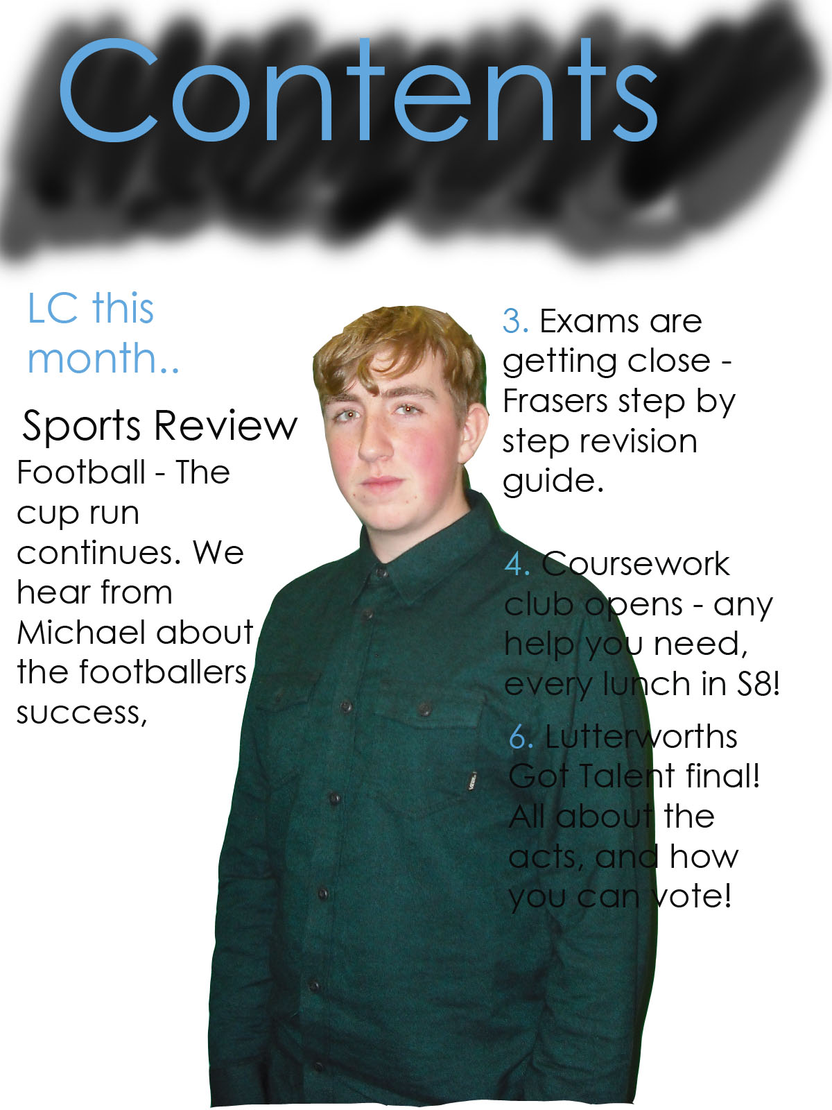
Typical Reader Profile
 This is Seb Harrington, he is a 16 year old male. I chose him as a typical reader for my magazine as I know him well personally, and feel that he could relate to my magazine, and would be the exact type of person to want to read it. He keeps up with the up to date, non mainstream music and has a subscription to the NME magazine, but feels that more could be offered to the magazine and it could be changed a little, which is what my magazine would do. He also likes to read magazines such as Kerrang, Q and Rolling Stone. Seb likes a wide variety of music, including bands and artist such as Foals, The Stroke, The Vaccines, The Horrors, Paolo Nutini and The XX. I chose him as my typical reader as he said that he thinks there is a lack of indie music magazines around, and that more are needed so there is a wider variety and something a little different.
 Magazine Publisher

I have chose IPC Media for the publisher of my magazine. This is mainly for the reason that it is the publisher of the NME magazine, which is the magazine that I was most inspired by, and the one which is closest to my magazine genre. I feel IPC Media is a very well-known company, so would be able to publish my magazine in the correct manor, and put it to its full potential. IPC Media also aim there magazine at a very similar target audience as mine (16-26) so I feel that if people knew my magazine was published by them, they would get the concept before they even see the magazine as to what it is about and what kind of age range the magazine is for.
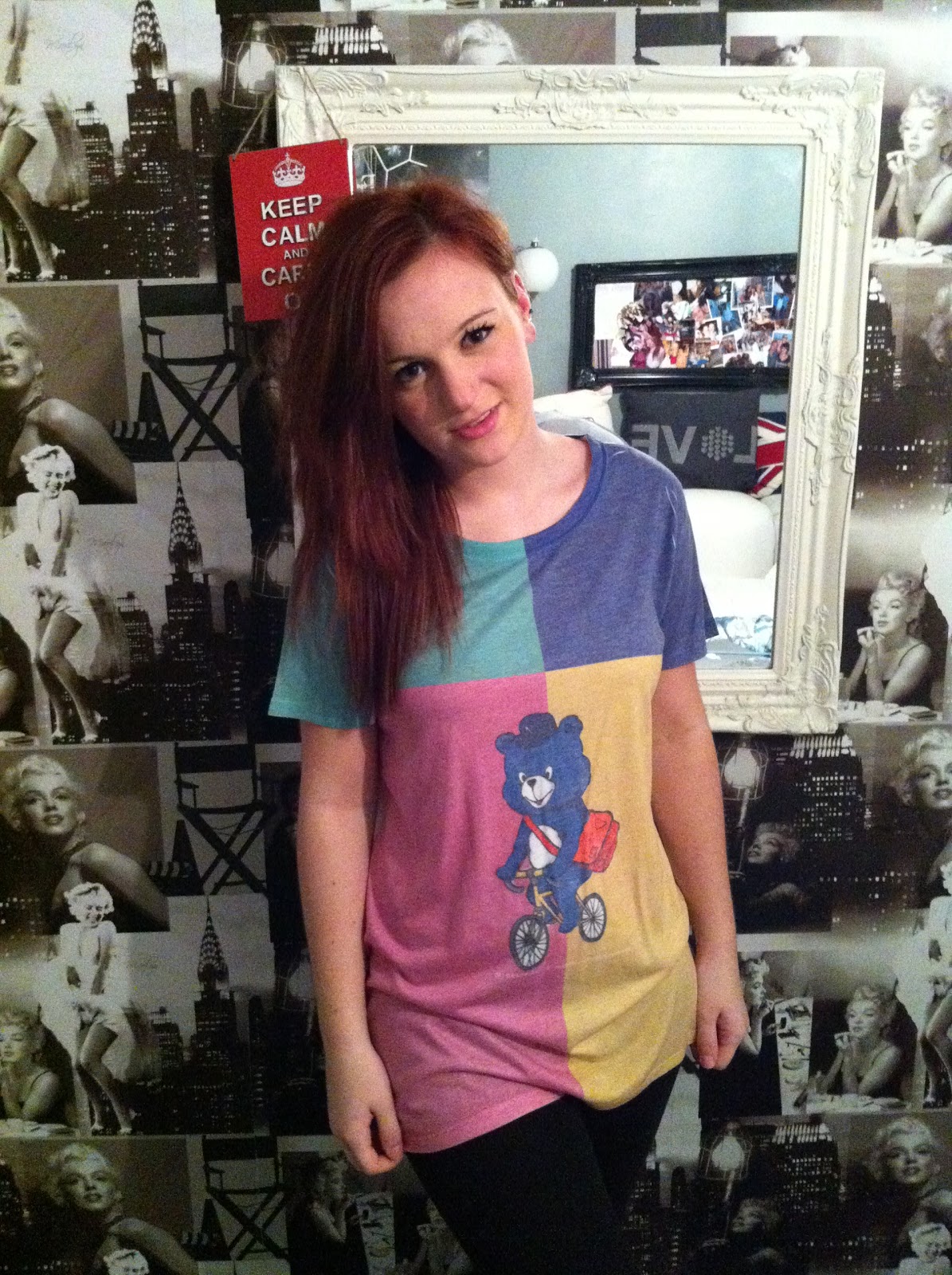
Test Shots

 All of these images represent the ideas I have as to what kind of angle I want my shot for my magazine. I plan to do a full body shot for my front image, whilst a close up for my double page spread. However on my final piece, I plan to use a female for my picture, but didn't have the adequate amount of time to get the person I wanted for the test shots. I also plan to change the lighting on one or two of the pictures slightly, eg. Shadows or a darker background. But due to only being able to do these in school and with a short amount of time, wasn't able to get the shots as good and as close to the real thing as I would of liked them to be.


Mock ups


This is an idea of what I want my magazine, double-page spread and contents page to look like. The front page has a variety of colours and words. There is a simple masthead across the top, and the name of my model straight through the middle. I have also involved band names, to give an insite as to what will be inside my magazine. My double-page spread will have one large picture covering the whole of the left hand side of the page, and I have spoke about how I want this picture in my pitch evaluation. My contents includes a lot of information and will include 2/3 pictures of different shots of people and festival/gigs. The contents page will be very crowded as I feel that is a concept of the indie genre magazines that are already out, and feel that it gives it a good affect.
Tuesday 31 January 2012
Artist Profile
For my artist profile I am using a female, Lillia Dunkley, aged 17. I chose this gender and age so it differs from other indie music magazine. The indie cultured music is up and coming quick in this day and age, and this is another new break-through artist which has managed to succeed in the music industry through all the tough competition. Indie/rock music has always been an inspiration in her life, and after growing up listening to older music such as The Beatles, she was always planning on making her own indie sounds, through her voice and guitar. The success started in 2010 when she simply started uploading videos of herself playing the guitar and singing. After a few months she was picked up by some simple music producers, before finally signing a record deal in late 2010. After her first song ‘Fear Not’ was brought out in 2011, she was starting to become a massive success already in the UK, after the song stayed in the top 10 in the UK Top Indie 40 for an impressive 13 weeks. By this time an album had been released, which also made a massive impact on the indie music scene. For this, she won a Grammy award for ‘Best New Artist’ during the end of 2011. Music is the only thing she’s ever really focused on in life, and is all she has wanted since the age of 9 when she realised her talent. Currently, she’s 17 and still enjoying the new, unusual fame.
Thursday 26 January 2012
Summary of pitch
I feel that my overall pitch went quite well. I reasearched a lot into other magazines, so I could prove that mine would be different. For example, I found out the percentage of male readers in magazines such as NME, Rolling Stone and Kerrang so I could say how I was going to make equal, so it would be different from others. I recieved feedback from my teacher and class that the title of my magazine could of been improved, and that I should decide on a sprecific typography and layout for my magazine.
For the photography, I recieved feedback that using an instrument such as a guitar for my model to hold would look good and stand out more. So I have decided to do this, as well as using an outside scenery, such as a forest/tree background, so it matches the idea of my magazine more. My contents page will consist of pictures of different people, to match the main story headline. Also, I will use gig/festival photos to go with my promotion of winning tickets to one of this years festivals.
Due to my magazine genre being indie/rock, I recieved feedback about the importance of costumes, and how they have to match this genre. I decided to do casual clothes rather than formal, so came up with the idea of a colourful t-shirt and shoes, so the picture will stand out. My class gave me feedback about that being a good idea.
My camera angles will be quite simple, a full body shot for the front page, and a casual shot with the female holding a guitar for the middle page spread. I feel this gives the impression to the audience that the magazine is very casual, but the audience will still no its all to do with music, due to the guitar in the picture.
I spoke to my class about how my magazine would stand out from others, and found out that the colour scheme would help that, due to the other indie magazine normal colour scheme being red, white and black, but I am using a brighter blue rather than red. I also decided to use a female model instead of the stereotyped indie model of a male.
The price of my magazine would be around £2.00, this is due to it being slightly cheaper than NME magazine (£2.20) and I feel its an acceptable price for the public to buy
Wednesday 25 January 2012
Thursday 19 January 2012
Preliminary evaluation
For my preliminary work, it was a student based magazine, using images of students from out school, and all the headlines and stories where about our school.
I looked at a variety of magazines to inspire to get a basic guide on how I wanted my magazine to look. I firstly looked at my favourite magazines, such as NME, Kerrang and Q to look at how the magazine had set out (where the picture/text was etc). I also used these to look at different mastheads, to see whereabouts the different magazine had place them on the front cover, and came to the conclusion that nearly all music magazine have the masthead directly across the top of the page. Fonts and different colours where also something I tried to take into consideration, but due to the different type of Photoshop I had to use, adding new fonts and colour where very limited, and I had very little time to be able to put great detail into my work.
Being as I didn't even know how Photoshop worked before this task, I feel I have learnt a significant amount about it and about what different effects the program can do. I learnt how to neatly cut away a picture from its background, and how to blur or sharpen parts of the pictures which I used. I also learnt how to effectively use the hue, saturation and contrast tools to edit my photo to how I wanted it to be, in order to attract the viewers attention. I think my preliminary work could of been improved a lot if I had more time and more tools to use. However I feel that the white, black and blue colour scheme worked very well together, and allowed the masthead to stand out. I also think the pictures were cut out very effectively, and I used the blur and sharpen tool to make the pictures stand out how I wanted them to. Time was unfortunately the main concern as to why my work wasn't as good as I wanted it to be, but I look forward to using Photoshop again when I do have more time to do the work. Finally, the thing I would most like to improve is the place of the picture, and to neaten the work up a bit. I would also like to add a background to the magazine cover, or shadow the picture.
Tuesday 17 January 2012
UK Tribes
The video on the UK Tribes website does a short interview with a large number of teenagers. All the teenagers are very different and each have their own style which they talk about. Depending on how they look, relates to what hobbies and interests they have. It tells us of how many different groups of friends all like the same music, and like to dress the same.
Rolling Stone magazine - Target audience
Rolling Stone
Audience of 11,899 in which 60% are male and 40% are female
They target an age of 18+, and 27% of the readers are between 18-24. Another 27% are aged from 25-34, 20% from 35-44, 14% from 45-54 and a small 13% from the age of 55 and above.
This is similar to my magazine, however I plan to make mine 50% male and 50% female. I chose this as alot of the indie genre magazines are more male than female. My age range is also slightly differrent, as I want to start mine from 16 rather than 18.
Sunday 15 January 2012

Subscribe to:
Posts (Atom)